Color theory in Fashion designing is a vast subject that we learn with all perception. Colors have powerful effects on human Psychology. Sketching and coloring are two vital parts of fashion designing that every student has to learn. Color is the most important aspect of design, without it dress designing is totally incomplete.
We need to know the basics part of color classifications and combinations after drawing and illustration. Here I am trying to cover a little history of color formation and theory so that anyone can draw and color fashion illustration easily. DIY is the best option for creative learning. You don’t have to be an artist to understand fashion sketching and coloring.
Coloring in Fashion Design:
We can’t visualize life without colors. Color is the description of visual perception through categories with different hues. After freehand sketching and professional illustration drawing, we need to understand the characteristics of color theory in fashion design. There are basic categories that are based on color charts. Fashion designers are using their ideas to implement with the help of different color palettes for their collections. Comprehending color theory in fashion design is quite interesting.
Little History:
We get references from history books about the color theory believed to be written by Italian humanist author, artist Leone Battista Alberti in 1435. The greatest Italian painter Leonardo da Vinci also mentioned color theory in his journals in the late 1400s. At that time many historical “color theorists” have presumed that three “pure” primary colors can mix all possible colors. Later, Sir Isaac Newton developed color theory when he improved his book Opticks. The books Opticks: A Treatise of the Reflexions, Refractions, Inflexions, and Colors of Light in the year 1704 analyze the fundamental nature of light.
Color Wheel:

The color wheel or color circle is the illustrative model for blending colors, which shows different shades and hues. It shows the relationship between primary, secondary, and intermediate shades together. Historically, the first diagram was designed by Sir Isaac Newton around 1665. Color Wheel is mandatory for Fine Arts students, Painters, Fashion Designers, etc. We can experiment with tints and shades of colors in designing garments. The wheel shows a combination of color structures in a proper format.
Primary Colors:
There are three primary colors RED, YELLOW, BLUE (RYB). These primary colors became the foundation of 18th-century theories of Color vision. We can say they are basic color pillars because these colors cannot be created by mixing other colors. On the side, photography, and print-media primary colors are magenta (red), cyan (blue), and yellow (CMY). There are two types of primary colors.
Additive color:
The primary colors are RED, YELLOW, BLUE (RYB) but according to additive theory, the primary colors are RED, BLUE, GREEN (RBG) because those colors are found in photoreceptors (specialized cells) of the human eye. By mixing of these three colors together in the form of light, it will generate white is called additive color.
Subtractive color:
MAGENTA, CYAN, YELLOW are the primary subtractive colors. These colors consume primary colors like Magenta soak Green, Cyan soak Red, Yellow soak Blue, the result is to eliminate color and produce Black. We can say, in this CMYK format, K stands for Black.

Secondary Colors:
Secondary colors formed by mixing two primary colors. Historically, We have three primary colors RED, YELLOW, BLUE. When two primary shades combine then it produces secondary colors. There are three types of secondary colors.
For example:
Red + Yellow = ORANGE (Secondary Color)
Red + Blue = VIOLET (Secondary Color)
Yellow + Blue = GREEN (Secondary Color)
Tertiary Colors:
Tertiary colors are the mixtures of primary and secondary colors. We have Six types of tertiary colors.
For Example:
Red + Orange = RED ORANGE (Tertiary Color)
Yellow + Orange = YELLOW ORANGE (Tertiary Color)
Yellow + Green = YELLOW GREEN (Tertiary Color)
Blue + Green = BLUE GREEN (Tertiary Color)
Blue + Violet = BLUE VIOLET (Tertiary Color)
Red + Violet = RED VIOLET (Tertiary Color)
Tints and Shades:


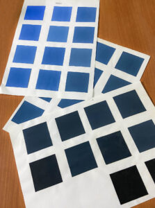
In color theory, the process of mixing solid colors with white is called Tints. Meanwhile, mixing a solid color with black is called shades. Tints and shades mean light and dark formation of colors. The increase of white shows a lighter shade of that solid color, and by adding black with that solid color increases darkness. Blending color with proper ratio forms beautiful hues. In fashion illustration Light and shades shows the proper depth, folds, styling, detailing, and highlight designs of the garments.
Colors Tool:
In fashion illustration, we are using different types of tools to practice fashion art. Sketching with color pencils, watercolor, and micro tech pens, sometimes pastel color is a good option for creating fun in drawing, etc. I have given all details regarding essential categories and fashion designing tools in my other article. That will help everyone to understand basic needs in DIY fashion illustration design.
So Friends, practice DIY sketching and coloring drawing easily. Aim to render outfits with proper depth and shades, and try to create DIY fashion abstract art, flat sketch, fashion illustration, doodling, etc. Make your learning fun and interesting

